seltzer refresh
branding and packaging design
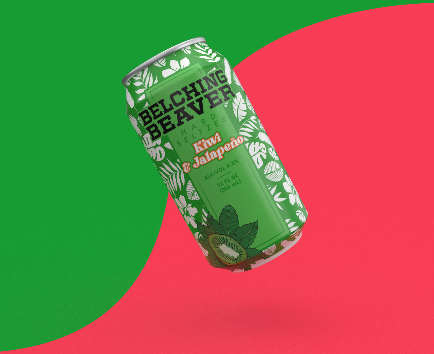
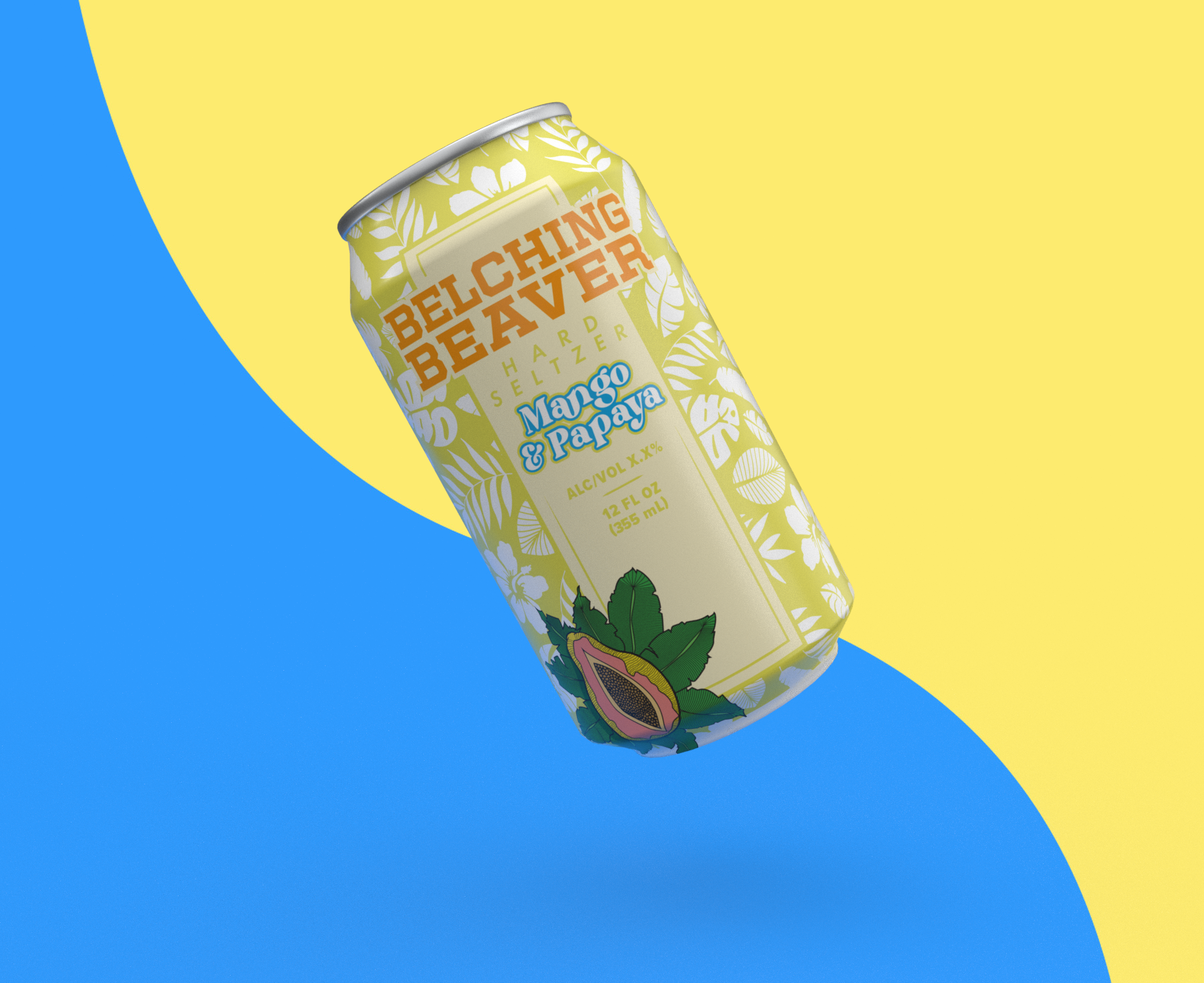
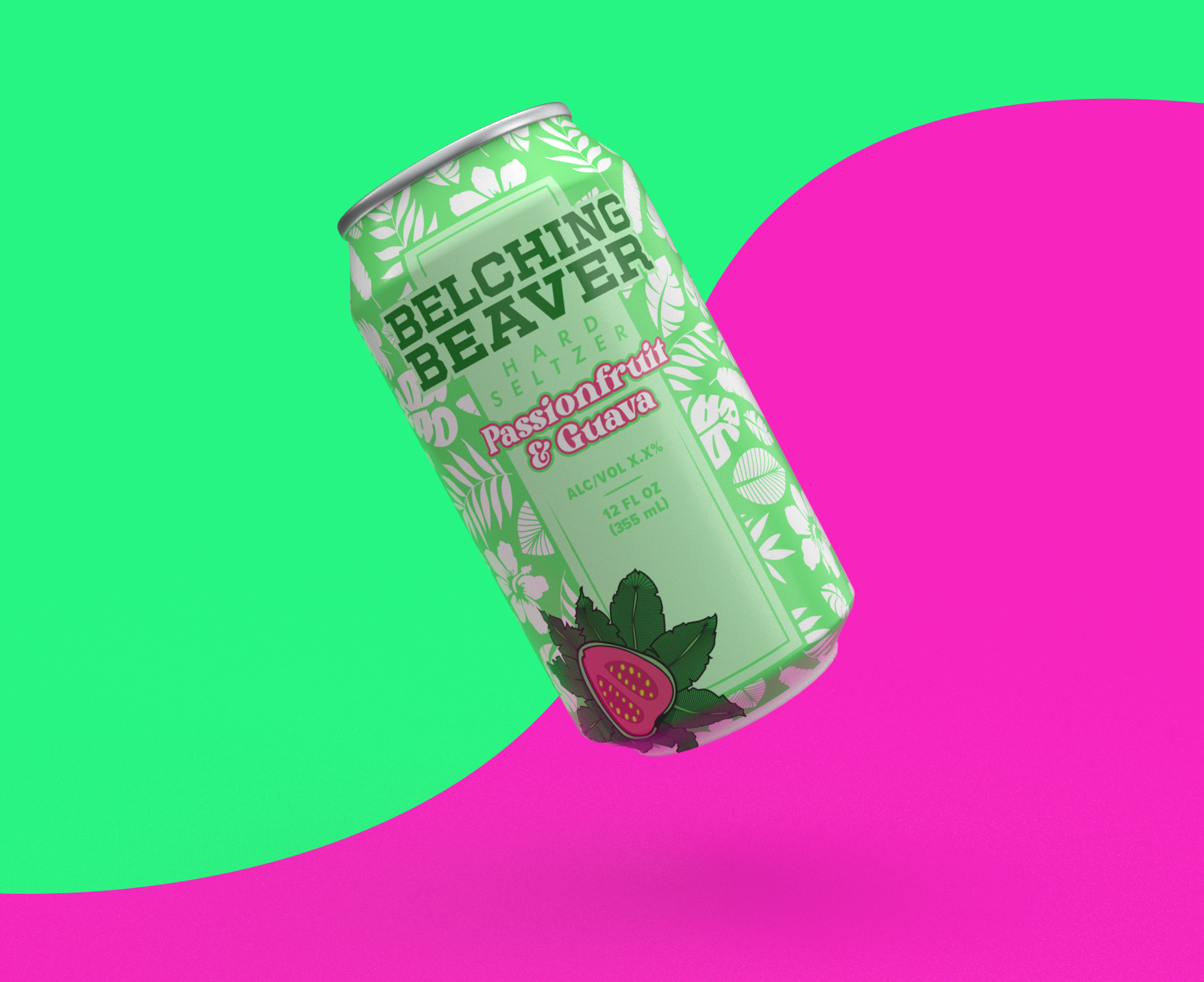
Branding refresh for Belching Beaver Brewery’s hard seltzer line. I was tasked with creating something light, colorful and playful - like a Hawaiian shirt on a can.
I chose a slightly less saturated color palette, to allow the illustrations to really pop out. I illustrated the centerpiece fruits, and also about half the elements in the background Hawaiian pattern. I chose a playful serif font to hit the playfulness of the brief and really stand out from the brand’s slab serif wordmark.
Unfortunately, this project did not get further than this stage, although it was a lot of fun and I think it would have looked great on a shelf somewhere.
client
Belching Beaver Brewery
tools used
Photoshop, Illustrator, Adobe Dimension, Traditional Media
role
Design, Illustration, Art Direction
year
2023
